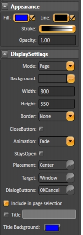
 The Appearance parameters dictate the brush style used when drawing objects in the display, including colors. Clicking on the Fill option lets you specify Colors, gradients, or objects with which to fill the graphic.The Appearance parameters dictate the brush style used when drawing objects in the display, including colors. Clicking on the Fill option lets you specify Colors, gradients, or objects with which to fill the graphic.
Commands | Description |
 Selection Tool Selection Tool | •Click an object to select it. •CTRL+click to select multiple objects (and object groups), one at a time. Hold down the CTRL key as you click each object. •Shift+click to toggle selected object from among more than one selected objects. •Click in an open area of the display then select a group of elements by highlighting the elements while holding down the left mouse button. •Double-click an object to open the Dynamics Configuration window, which provides settings for dynamic object properties. |
 Direct Selection Tool Direct Selection Tool | •Use this tool to select an object inside a group (and modify its properties). Click the object to select it. •You can also add, remove, and modify the points in a Polyline with the Direct Selection Tool: •To move the point select it by clicking the point and holding the left mouse button down. Drag the point to its new position. •Double-click a point to add a new point adjacent to the selected point. •Right-click a point to delete the selected point. |
 Hand Tool Hand Tool | Use the Hand Tool to modify the view window by clicking the display background and holding down the left mouse button then shift the display to the desired position. |
Geometric objects tools | Right-click to end use of each tool. To add, modify, and remove points after creating a polygon or polyline, use the Direct Selection Tool. |
 Rectangle Rectangle | Creates a rectangle object. |
 Ellipse Ellipse | Creates an ellipse object. |
 Polygon Polygon | Creates a polygon object. |
 Polyline Polyline | Creates a polyline object. |
 Button Button | Creates a button object. |
 LabelBox LabelBox | Creates a label box. |
 Text Output Text Output | Creates a text output object. |
 Text Box Text Box | Creates a text input/output (I/O) object. To link the text I/O object with a tag, double-click the text I/O object, under the Dynamic configuration window select the TextIO dynamic. |
 CheckBox CheckBox | Creates a check box object. Right-click this button to access the following tools:  Creates a radio button object. Creates a radio button object. Creates a combo box. Creates a combo box. Creates a list box. Creates a list box. Creates a password box. Creates a password box. Creates a date picker. Creates a date picker. Creates a date/time text box. Creates a date/time text box. Creates a slider control. Creates a slider control.After selecting a tool from this menu, it becomes the default tool for that button in the vertical toolbar. |
 Open Symbol Library Open Symbol Library | The symbol library includes both built-in and user-defined symbols. |
 Web Browser Web Browser | Creates a Web Browser object. Right-click this button to access the following tools:  Creates a Page Selector object, where users can go directly to a page in the application. Creates a Page Selector object, where users can go directly to a page in the application. Creates a Report Viewer object. Creates a Report Viewer object. Creates an XPS Viewer object. Creates an XPS Viewer object. Creates a Pie Chart object. For more information, see Configuring a PieChart. Creates a Pie Chart object. For more information, see Configuring a PieChart. Creates a Bar Chart object. For more information, see Configuring a BarChart. Creates a Bar Chart object. For more information, see Configuring a BarChart. Creates a Calculator object. Creates a Calculator object. Creates a Child Window object. Creates a Child Window object. Creates an external WPF component. Creates an external WPF component.After selecting a tool from this menu, it becomes the default tool for that button in the vertical toolbar. |
 Alarm Window Alarm Window | Creates an alarm window. Position the alarm window and double-click to configure the alarm window settings. For more information, see Configuring an Alarm Window. |
 Trend Window Trend Window | Creates a trend window. Position the trend window and double-click to configure the trend window settings. For more information, see Configuring the Trend Window. |
 DataGrid Window DataGrid Window | Creates a data grid window. Position the data grid window and double-click to configure the data grid window settings. For more information, see Configuring a DataGrid Window. |
Commands | Description |
 | Grid definition |
 | Screen Zoom |
 | Group |
 | Ungroup |
 | Union |
 | Intersect |
 | Exclude |
 | Exclusive-Or |
 | AlignLeft |
 | AlignHorizontalCenter |
 | AlignRight |
 | AlignTop |
 | AlignVerticalCenter |
 | AlignBottom |
 | Move To The Front |
 | Move To The Back |
 | Change Z-Oder |
 | Resize Width |
 | Resize Height |
 | SpaceEvenlyHorizontal |
 | SpaceEvenlyVertical |
 | FlipHorizontally |
 | Flip Vertically |
 | Lock element |
 | Unlock element |
 | Unlock All Elements |
 | Show All Elements |
 | Hide Selected Element |